How to Spot a Bad Floor Plan: 7 Expensive Mistakes to Fix Before You Build
Moving walls is cheap on a screen but expensive in real life. Here is the architect's guide to the layout traps that ruin renovations and how to solve them.
The Cost of a Bad Layout
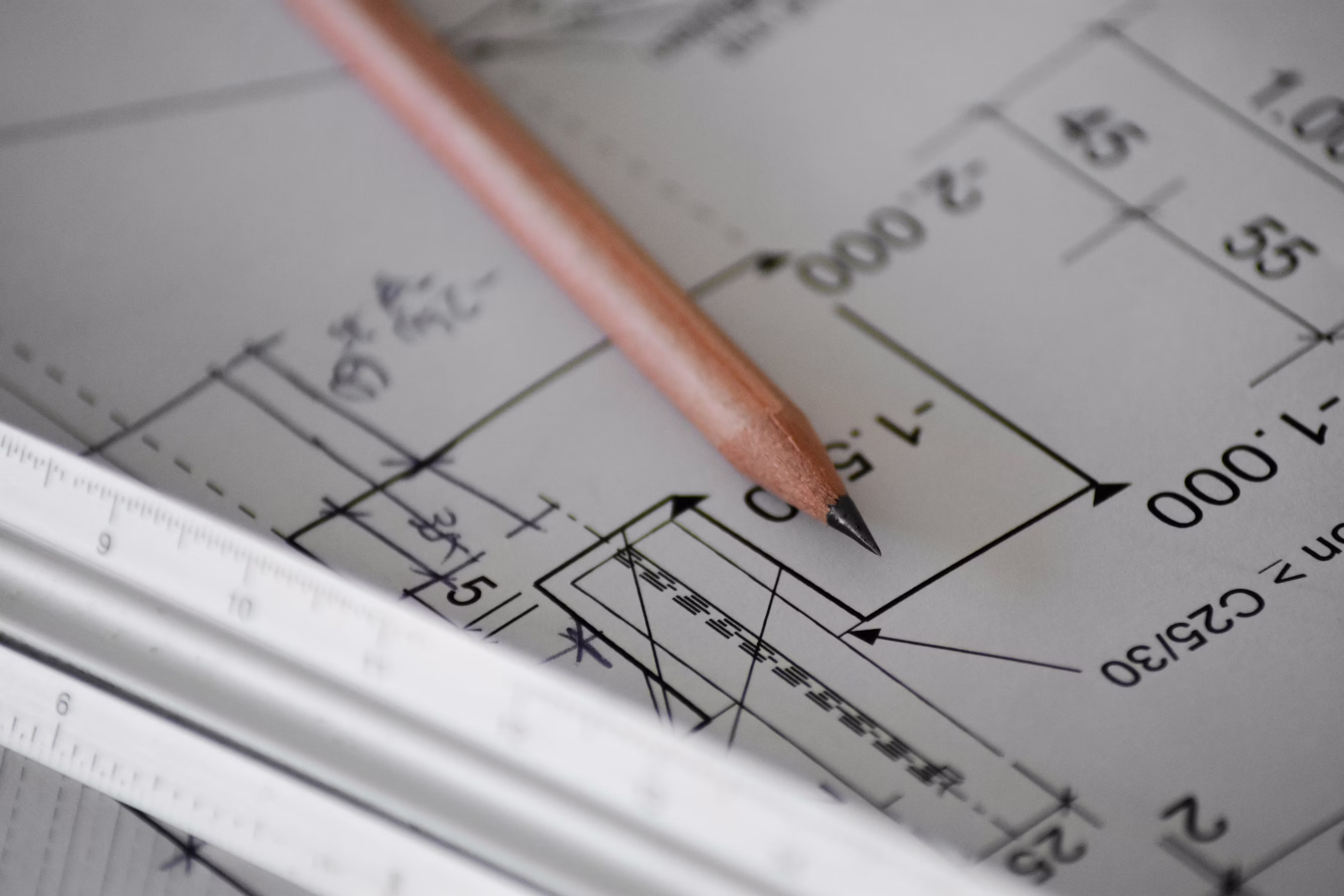
There is an old saying in architecture school: "Paper is cheap, concrete is expensive."
I once consulted on a renovation where the homeowner had "designed" the bathroom himself. It looked great on his sketch. But once the framers built the walls, we realized that if you sat on the toilet, your knees actually blocked the door from opening. He had to spend $3,000 moving plumbing lines just to gain three inches of legroom.
It costs exactly zero dollars to move a virtual wall in RoomyLab. It costs thousands to realize—after the drywall is painted—that your layout doesn't work.
Professional architects spend years studying "circulation paths" and ergonomics. If you are DIYing your renovation, you don't have that experience to fall back on. To help you bridge that gap, I have compiled the 7 most common (and annoying) layout traps I see beginners fall into.
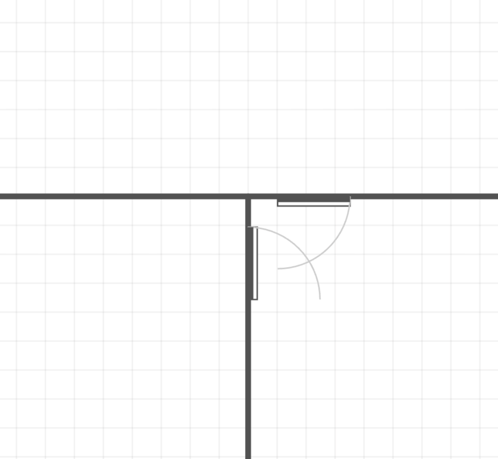
1. The "Door Conflict" (The Clash)
This is the number one offender in smaller homes and hallway renovations. You place two doors near each other—typically a bedroom door and a closet door—without checking their "swing arc."
The Problem: You have to physically close one door just to open the other. It creates a constant, irritating dance every morning when you're trying to get dressed.
The Fix:
- Check the Arcs: Always draw the full 90-degree swing on your floor plan.
- The Protocol: Ensure a door never swings into a hallway; it should almost always swing into the room to keep the corridor clear.
- Change the Hardware: If swings overlap, swap a standard hinged door for a pocket door or a barn door. This eliminates the swing radius entirely.
2. Ignoring "Sight Lines"
A floor plan is a bird's-eye view. This dangerous perspective makes us forget about what we see at eye level (approx. 60 inches off the floor).
The Problem: You design a beautiful open-concept living room, but the main seating area looks directly into the bathroom, or your dinner guests have a clear view of the messy laundry room.
The Fix: Perform a "Visual Check." Draw a straight line from your main "zones" (sofa, dining chair, kitchen island). What does that line hit?
- Bad: It hits a toilet or a hamper.
- Good: It hits a window, a piece of art, or a blank wall.
- Solution: If the sight line is bad, create a "privacy vestibule" (a small transitional hallway) or simply flip the door hinge so the door creates a screen when partially open.
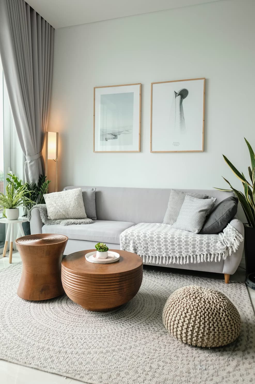
3. The "Runway" Living Room
In an effort to make rooms feel spacious, people often push all the furniture against the walls.
The Problem: This creates a massive, awkward empty space in the middle of the room (the "runway"). While it looks big, it kills conversation. You have to shout across the void to talk to someone. It makes a living room feel like a waiting room.
The Fix: Float your furniture. Pull the sofa and chairs off the walls to create a cozy island in the center. Ideally, the front legs of all seating should sit on a rug. The space behind the sofa then becomes your walkway, keeping the conversation zone peaceful and intimate.
4. Blocking Natural Light
Windows are the most valuable asset in any room. They dictate how the space feels.
The Problem: Placing tall furniture (bookshelves, armoires, or high-backed sectionals) directly in front of windows. This not only blocks natural light but creates a visual barricade that makes the room feel claustrophobic.
The Fix: Treat window zones as sacred. If you must place furniture there, choose low-profile pieces—like a bench or a low console table—that sit below the window sill height.
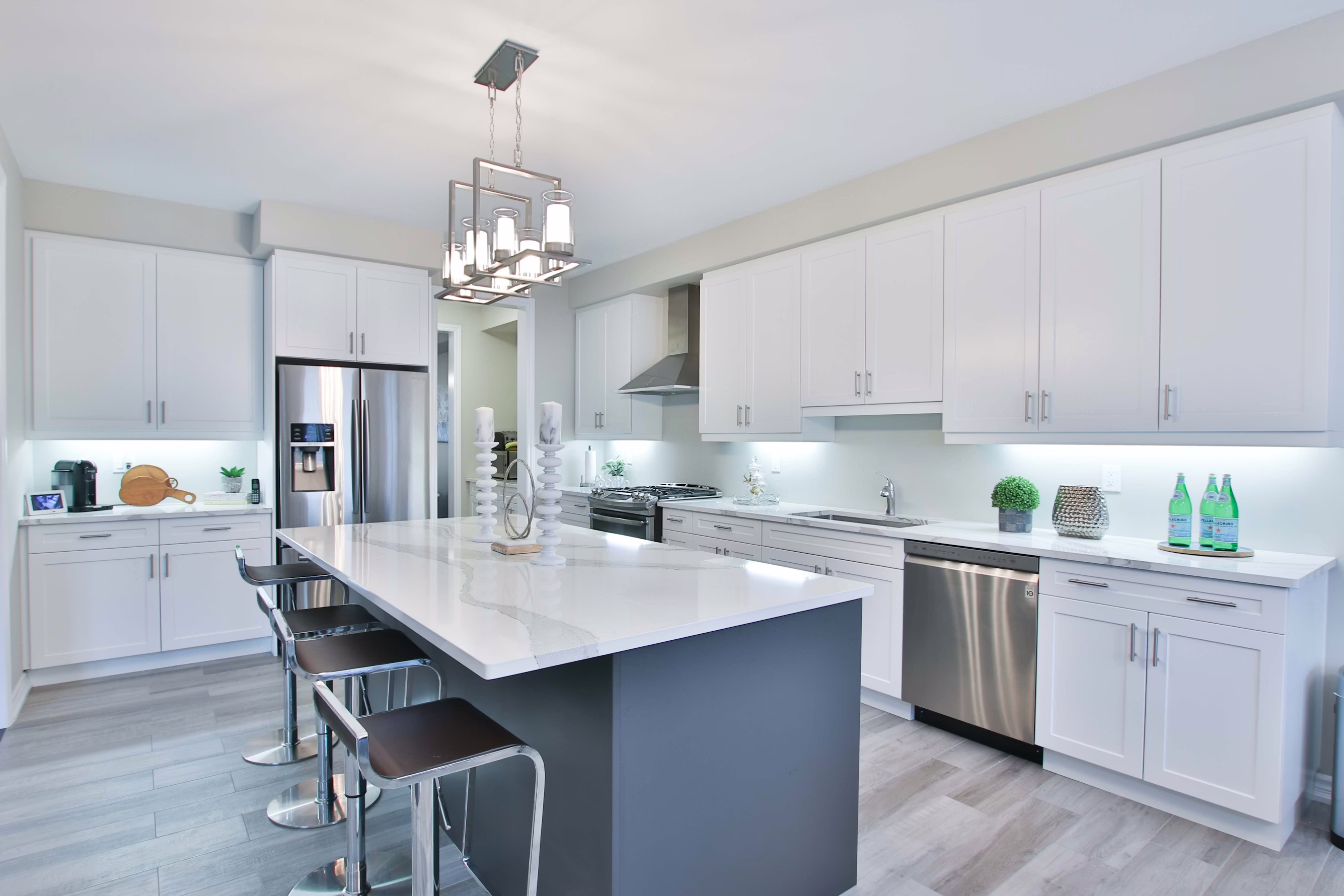
5. The "Hip-Banger" Kitchen Island
Everyone wants a kitchen island. It is the number one request I get. But not every kitchen has the footprint for one.
The Problem: Forcing an island into a narrow kitchen. If you don't have enough clearance, you will quite literally bruise your hips every time you walk past it.
The Fix: Follow the "42-Inch Rule."
- Minimum: You need 36 inches of clearance on all sides of an island for a walkway.
- Working Zone: If you have a dishwasher or oven opening toward the island, you need 42 to 48 inches. A dishwasher door is usually 24-27 inches tall; if you only have 36 inches of clearance, you can't stand in front of it to load it.
6. Neglecting Vertical Storage
Floor plans are 2D, so we tend to think in square footage. But storage volume is 3D (cubic footage).
The Problem: Filling the floor with heavy dressers and cabinets while leaving the upper walls empty. This "floor clutter" eats up your walking space and makes the room feel small.
The Fix: Go high. Use tall bookcases, floor-to-ceiling built-ins, or wall-mounted shelving. By moving storage up the wall, you reclaim the floor area for movement, making the room feel physically larger.
7. Forgetting the Outlets
You have the perfect layout: the sofa floats in the middle of the room, and the desk is by the window.
The Problem: You move in and realize the nearest outlet is 12 feet away. You are now living in a web of ugly orange extension cords.
The Fix: Map your electrical before you buy furniture. If your dream layout requires a lamp on a floating side table in the middle of the room, you need to budget for a floor outlet installation. Do not assume you can hide cords under a rug—it's a fire hazard and a tripping risk.
How to Visualize This in RoomyLab
You cannot solve these problems in your head. You need to see them. Here is how to use RoomyLab to "stress test" your plan:
- Set the Door Swing: When you drag a door from the library, look for the curved line (the arc). Rotate the door until that arc swings against a wall, not into a walkway.
- The "Mannequin" Test: In the "Helpers" section of the library, grab the "Human Figure" (top-down view). This figure is scaled to represent a standard person. Drag him through your hallways and between furniture. If he doesn't fit, neither will you.
- Draw Sight Lines: Use the Line Tool to draw a red line from your sofa to the bathroom door. If the line connects, move the furniture or the door.
- Mark Electrical: Use the "Symbol" tool to drop small "X" marks where your current outlets are. This forces you to design around your actual power sources.
3 Hidden Process Mistakes to Avoid
Beyond the layout itself, here are three "process" mistakes that cost my clients money:
- Ignoring Wall Thickness: In a sketch, a wall is a line. In reality, an interior wall is roughly 4.5 to 5 inches thick. If you have a 10-foot space and you divide it into two 5-foot closets, you will actually end up with two 4'9" closets because the wall took up space. Always account for the wall thickness in RoomyLab settings.
- The "Delivery Path" Trap: You measured the room, and the sofa fits. Great. But did you measure the hallway leading to the room? Or the elevator? Or the turn in the staircase? Always measure the path of delivery, not just the destination.
- Moving "Wet Walls" Whimsically: Moving a toilet 3 feet across a room seems easy on a plan. In reality, it requires jackhammering concrete or cutting through floor joists to move the soil stack. Always consult a plumber before moving a fixture that uses water.
Frequently Asked Questions
Q: What is the absolute minimum width for a hallway? A: International Residential Code usually allows for 36 inches. However, 36 inches feels tight, especially if you have artwork on the walls. I always recommend 42 inches or wider for a main hallway to allow two people to pass each other comfortably.
Q: Are pocket doors expensive? A: The hardware itself is cheap, but the labor is higher. A pocket door requires the wall framing to be built specifically to house the door (no studs can be in the way), and it complicates electrical wiring in that wall section. Expect to pay 20-30% more for installation than a standard swing door.
Q: Can I put a stove in a kitchen island? A: You can, but it's tricky. You need a way to vent the smoke. This means either a large overhead hood (which blocks sight lines) or a "downdraft" vent (which is expensive and generally less effective). I usually prefer the sink in the island and the stove on a wall.
Stop imagining and start planning. Open RoomyLab now to check your door swings and save yourself a renovation headache.
Inspired? Start planning now.
Use our free browser-based tool to visualize this advice in your own home. No account needed.
Launch RoomyLab Editor